
After joining the Insights team at Postman, it became clear that our intended user journey wasn't properly supported by what was in the product. This disconnect lead to potential users not understanding our value prop or where we would fit in with their tech stack.
Needless to say, this hurt adoption both internally and with the few external users we had.
We knew something was off experience-wise, but weren't sure exactly what it was. To figure this out, I conducted a UX audit that identified where Postman Insights was falling short on solving user problems and where UI patterns were confusing.
This fruits of this audit became the foundation for a UX refresh and the justification for making it happen soon.
My UX audit gave the Insights team a clear picture of where the experience was falling short, even though the path forward was still foggy. After a stalled Zoom with engineering and product, I pushed for an in-person whiteboarding session, and together we mapped a new golden-path flow we felt confident in.

We redesigned the Error Details page to immediately surface the right information when users arrive from a Slack alert, making their first stop both clearer and more actionable.
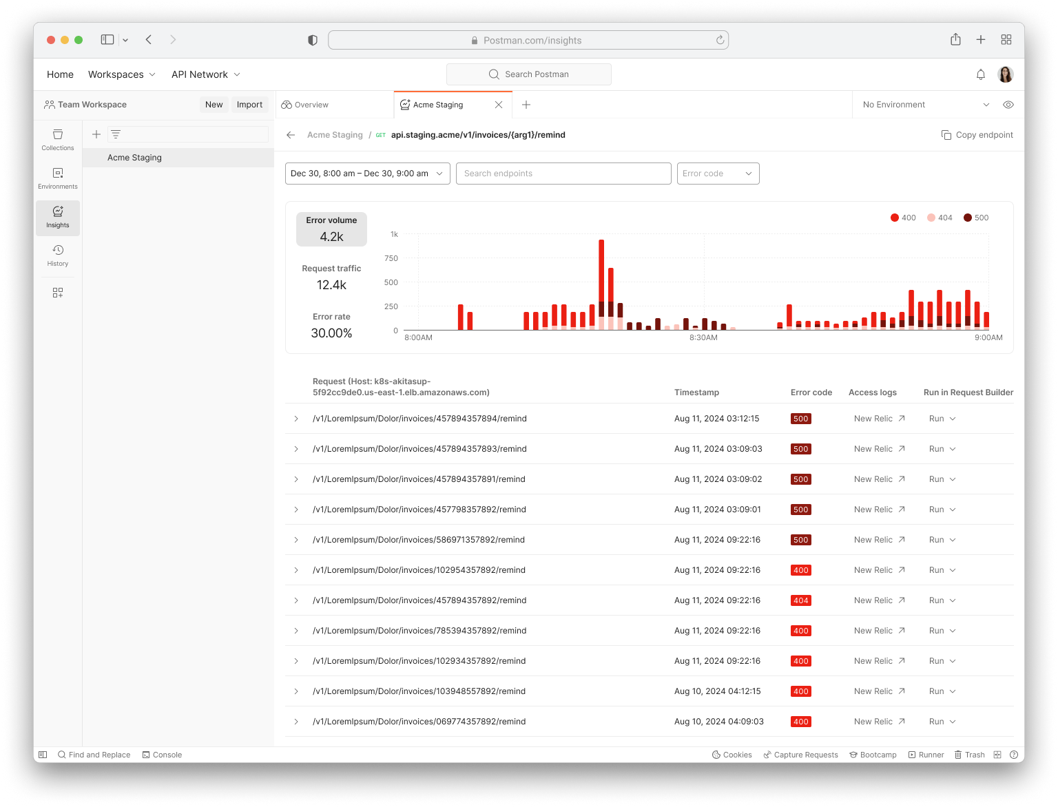
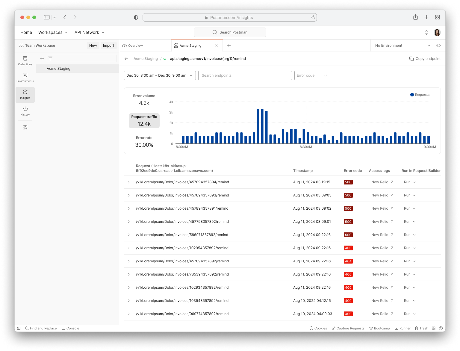
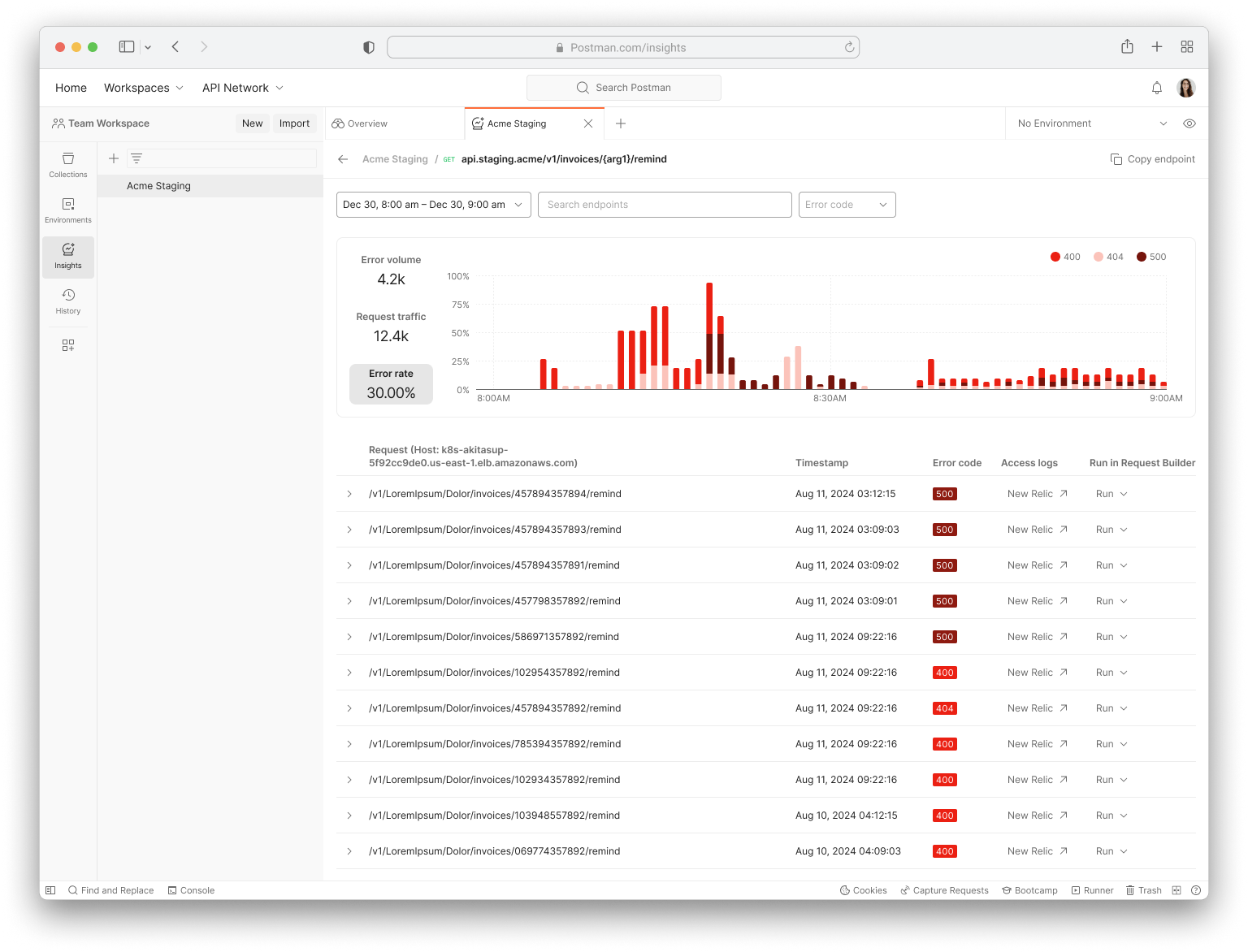
We revamped the Errors Feed to stay richly detailed while becoming far easier to browse, helping users quickly investigate any API errors in their system.
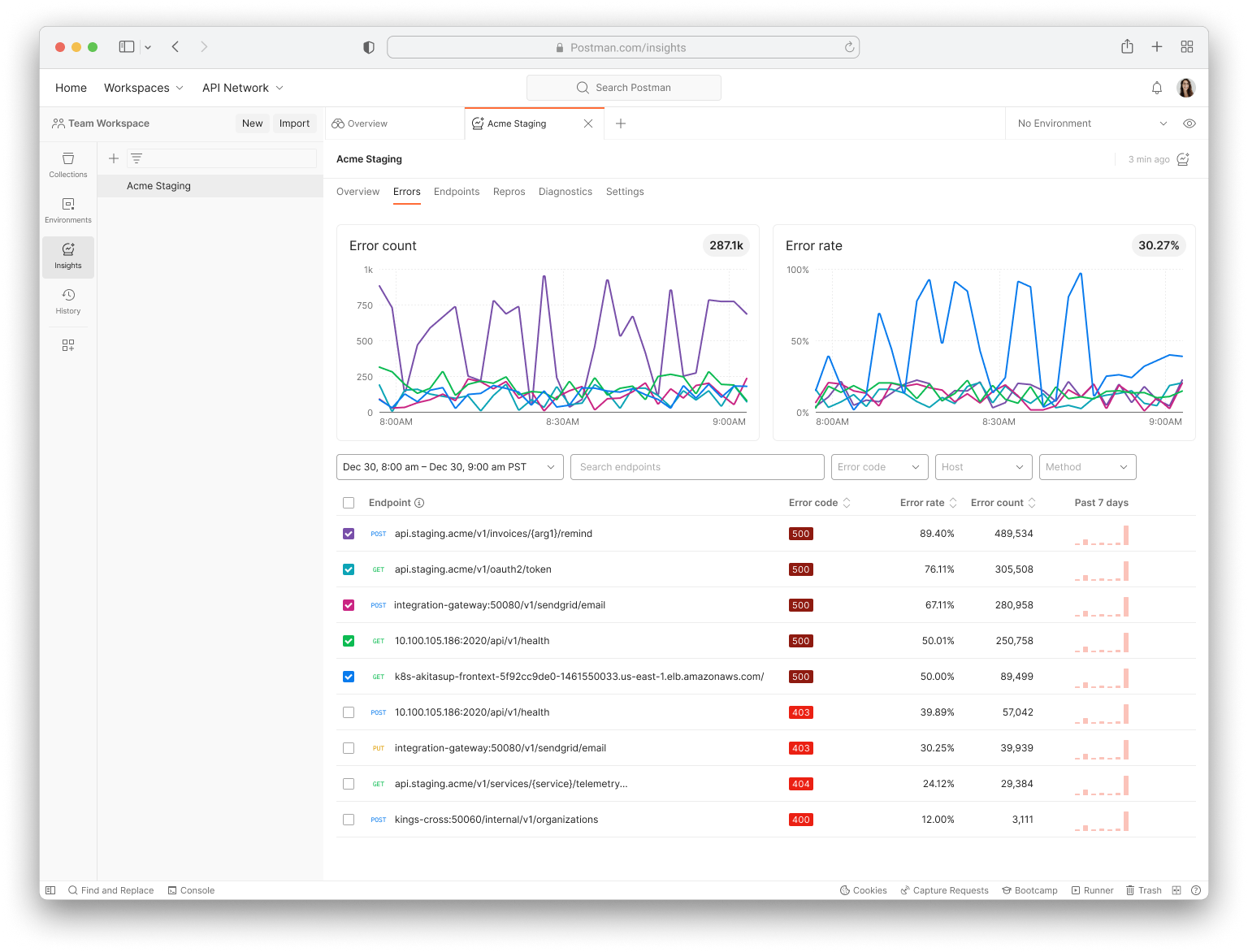
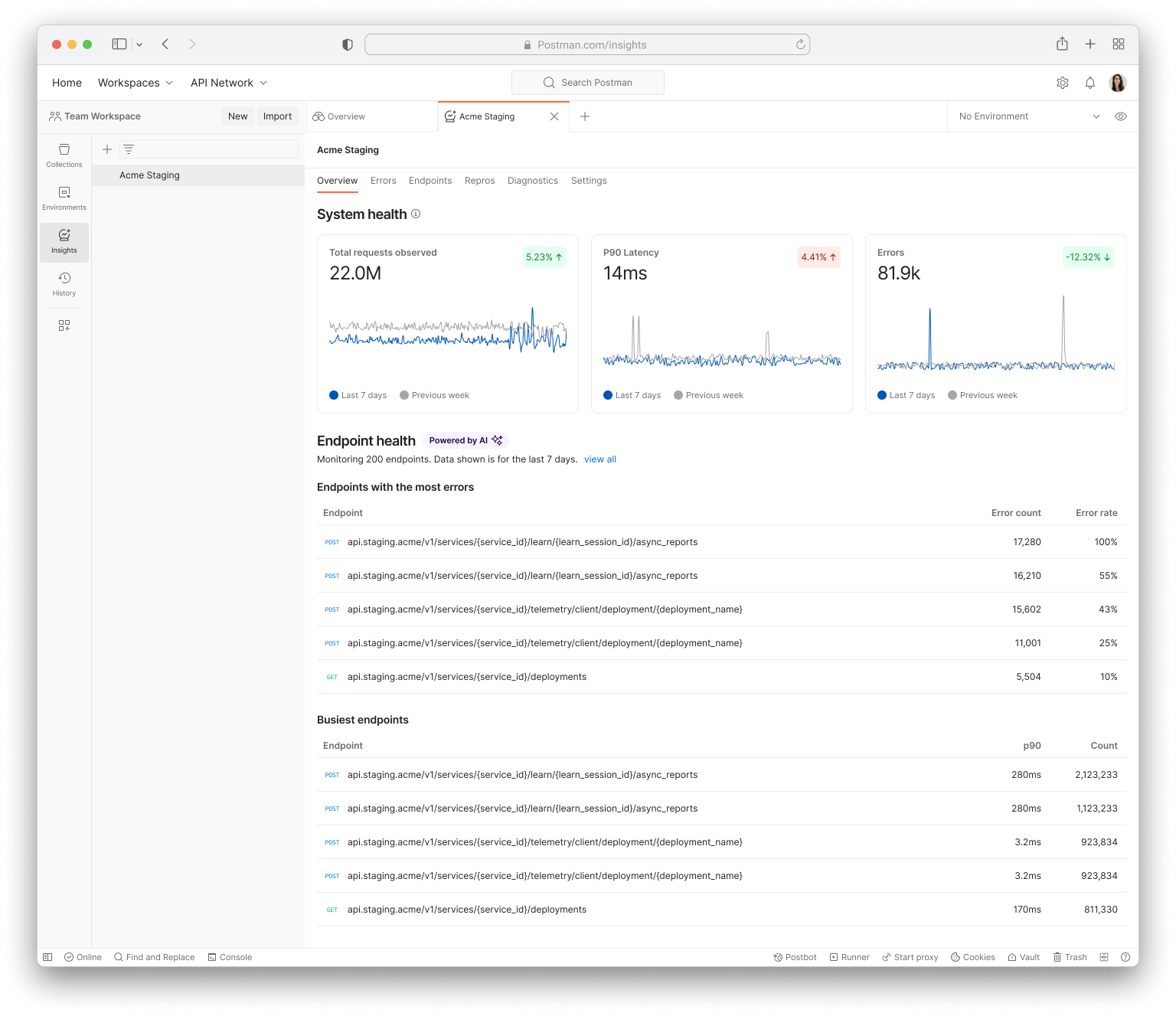
We refreshed the Service Overview page with clearer graphs and side-by-side 7-day comparisons, giving users a sharper read on how their service is trending.
Before this redesign, Postman Insights wasn't widely used internally, which blocked us from launching to external users. After demoing at the company-wide demo day, we received praise across teams and, more importantly, gained credibility. The majority of product teams voluntarily adopted Postman Insights for debugging instead of requiring a CEO mandate.